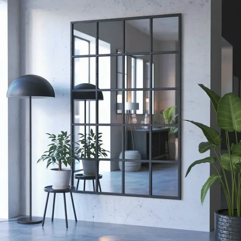
It’s funny what you notice when you’re sitting on a milk crate in what is technically your living room, eating cereal straight from the box because you haven’t unpacked a single bowl. That’s how I started my 350-sq-ft NYC studio journey, and honestly, the biggest lesson I learned is that small studio apartment ideas on a budget don’t come from a catalog. They come from staring at your four walls and getting creative with a paintbrush and a screwdriver.
I moved in with a futon, two suitcases, and a very stubborn belief that I could make this shoebox feel like a penthouse. The place was beige. So much beige. The previous tenant had left a faded tapestry of a wolf howling at the moon stuck to the wall with pushpins, which tells you a lot about the vibe I was dealing with. My entire budget after rent was $400, and I had to make every single dollar scream style without sounding like a broke college student. Here’s how the black and white transformation happened, one scuffed corner at a time.
Start with a Coat of White Paint (The Ultimate Illusion)
The very first thing I did was text my landlord to ask if I could paint. He said yes, probably because he didn’t think I’d actually do it, but I did. One weekend, I rolled three coats of bright white paint over every wall in the place. It sounds boring, but white paint is the cheat code for small spaces.
Light bounces off white walls like it’s getting paid to do it, which instantly makes a cramped room feel twice as big. The beige was absorbing all the light and making the ceiling feel like it was sitting on my head. With white, the ceiling just disappeared. I spent most of my budget on the paint and a good roller, but it was the single most impactful change for the money. If you can’t paint, look for wide, white adhesive sheets that you can smooth over walls, or just hang white fabric panels to break up the color.
The Graphic Black and White Foundation (Big Patterns, Small Cost)
Once the walls were white, I had a blank canvas, but it felt sterile. The secret to the black and white design isn’t just using both colors; it’s about scale. Large blocks of solid color are good, but a bold, graphic pattern makes the space feel intentional and artistic.
I found a massive roll of black and white self-adhesive contact paper for cheap and used it to cover the ugly top of my secondhand IKEA dresser. Then, I cut out a giant stencil of a Moroccan pattern and painted a single accent wall in the corner, just behind my bed. It took me about four hours and a lot of patience, but it looked like I had paid for high-end wallpaper. The pattern distracts the eye from the fact that the room is only nine feet wide. It adds depth and texture without taking up a single inch of floor space.
Use Lighting to Separate Zones (It’s Not One Room, It’s Three)
In a 350-sq-ft joint, you don’t have walls to put up, but you can trick your brain into thinking there are different rooms. Lighting is the best friend of any tiny apartment dweller. Nobody wants to sit in a single pool of harsh overhead light, because it makes the whole space look like an interrogation room.
Instead, I built three little zones using floor lamps and string lights. I put a tall torchiere lamp that casts light upward next to the futon for the living room vibe. For the kitchen area, I bought a cheap clip-on work light with a warm bulb and attached it to the upper cabinet. And for the bedroom corner, I strung a simple wire of Edison bulbs along the ceiling beam. Honestly, the warm bulbs make the black and white decor feel moody and sophisticated, not stark or cold. Lighting cost me about $35 total and it completely changed how the square footage feels.
Budget Decor That Pulls Double Duty (Sneaky Storage)
Here’s the thing about storage in a place like this: you have to be ruthless about it. You can’t have a single piece of furniture that only does one job. My futon is my couch by day and my bed by night, but the real heroes are the black plastic storage crates I bought for $5 each at a hardware store. I stacked three of them at the foot of the futon and put a piece of cut plywood on top. Boom, instant coffee table with hidden storage for all my winter sweaters.
Another huge tip is to use the vertical space above your sightline. I hung a black wire grid on the wall next to my desk. It holds my mail, keys, and headphones with little binder clips, so my desk stays completely clear for work. I also put a tension rod between the wall and the bathroom doorframe to hang towels and my bathrobe, turning dead air into usable storage. It’s not glamorous, but it works.
The Kitchen Counter Trick (A Place for Everything)
The kitchenette in many NYC studios is basically a hot plate, a mini-fridge, and a sink wedged into a closet. My counter space was about two feet long, which is where I eat, prep food, and store my coffee maker. The black and white theme can get cluttered fast if you don’t control what sits on the counters.
I bought a few white ceramic canisters for my coffee, sugar, and pasta, and one black utensil holder for my spatulas. Removing all the colorful packaging from my food made the busy counter look clean and cohesive. I also added a magnetic strip to the wall to hold my knives, which freed up the cutting board space. It’s a small thing, but when the counter is clear of knife blocks and random jars, the whole apartment feels tidier.
One Focal Point to Rule Them All (The Art Wall)
You don’t need expensive gallery art or a giant rug to make a statement. I had no money left, but I wanted something big above my headboard. So, I took a cheap painter’s drop cloth, stretched it over a wooden frame my neighbor was throwing away, and painted a massive black abstract shape on it. It looks like a minimalist art piece you’d see in a SoHo gallery.
The key to making a small place look sharp is to give your eyes one place to stop. If you have a million tiny trinkets scattered around, your brain feels overwhelmed. But if you have one large, dark focal point against all that white, it grounds the room. I put the art piece on a slight angle, leaning against the wall rather than hanging it straight. It gives the apartment that casual, editorial feel without looking messy. And it was basically free.
Make It Personal, Not Pinterest-Perfect
Look, there are plenty of tiny apartment tours online that look sterile and fake. You can’t live in a magazine. You are going to spill coffee, leave books on the floor, and maybe have a pile of laundry that lives on the chair for a week. Let your black and white theme be the structure, but let your humanity fill in the gaps.
I kept a bunch of my grandmother’s old, heavy novels out on the shelf even though they didn’t match the color palette. I also have a hideous bright orange power strip that absolutely ruins the aesthetic, but it’s the only one that reaches my desk. My apartment isn’t perfect, but it’s mine. The best part is that people constantly ask me if I spent a fortune on the decor, and I just laugh at them. Because the truth is, I thrifted my coat hooks, painted every scuffed piece of furniture, and I still spent less than $400 total.
Living in 350 square feet teaches you to be decisive. You can’t hoard things, you can’t buy stuff you don’t love, and you have to be honest about what you actually need. The all black and white design is a total game-changer for a budget studio, but the real change was learning to live with less. If you’re working on your own small apartment, just remember to start with the simplest thing, the walls, and work your way up.
Got a killer small-space hack? I’d love to hear it in the comments, this is a perpetual work in progress over here!
Leave a Comment